01 / Context
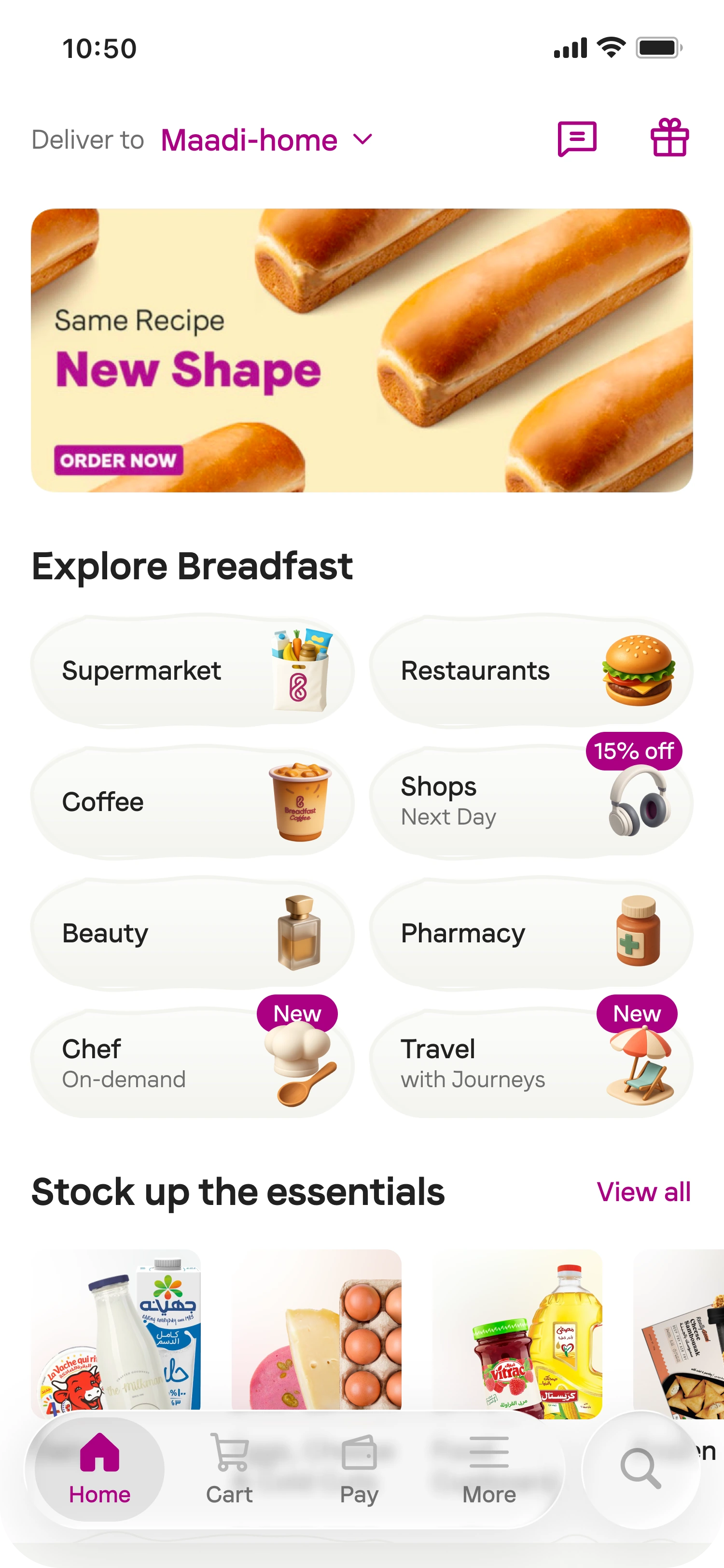
Breadfast was becoming more than grocery. Its homepage was not.
A grocery-first hierarchy had to make room for coffee, food, shops, beauty, pharmacy, travel, chef on-demand, and more. The challenge was to expose that ecosystem without overwhelming customers or slowing down grocery shopping.
02 / Framing the problem
Organize around user intent, not the org chart.
Business units naturally optimized for their own visibility. Customers came with recurring missions: replacing an essential, buying trusted products, getting breakfast and coffee, or solving an urgent need quickly.
The homepage needed to increase use cases per customer while preserving performance. Adding more category icons would not, on its own, make those destinations discoverable.
- Discoverability
- Make the ecosystem visible.
- Cognitive load
- Keep navigation immediately legible.
- Core mission
- Protect fast grocery shopping.
03 / Information architecture
Multiple entry points. One unified experience.
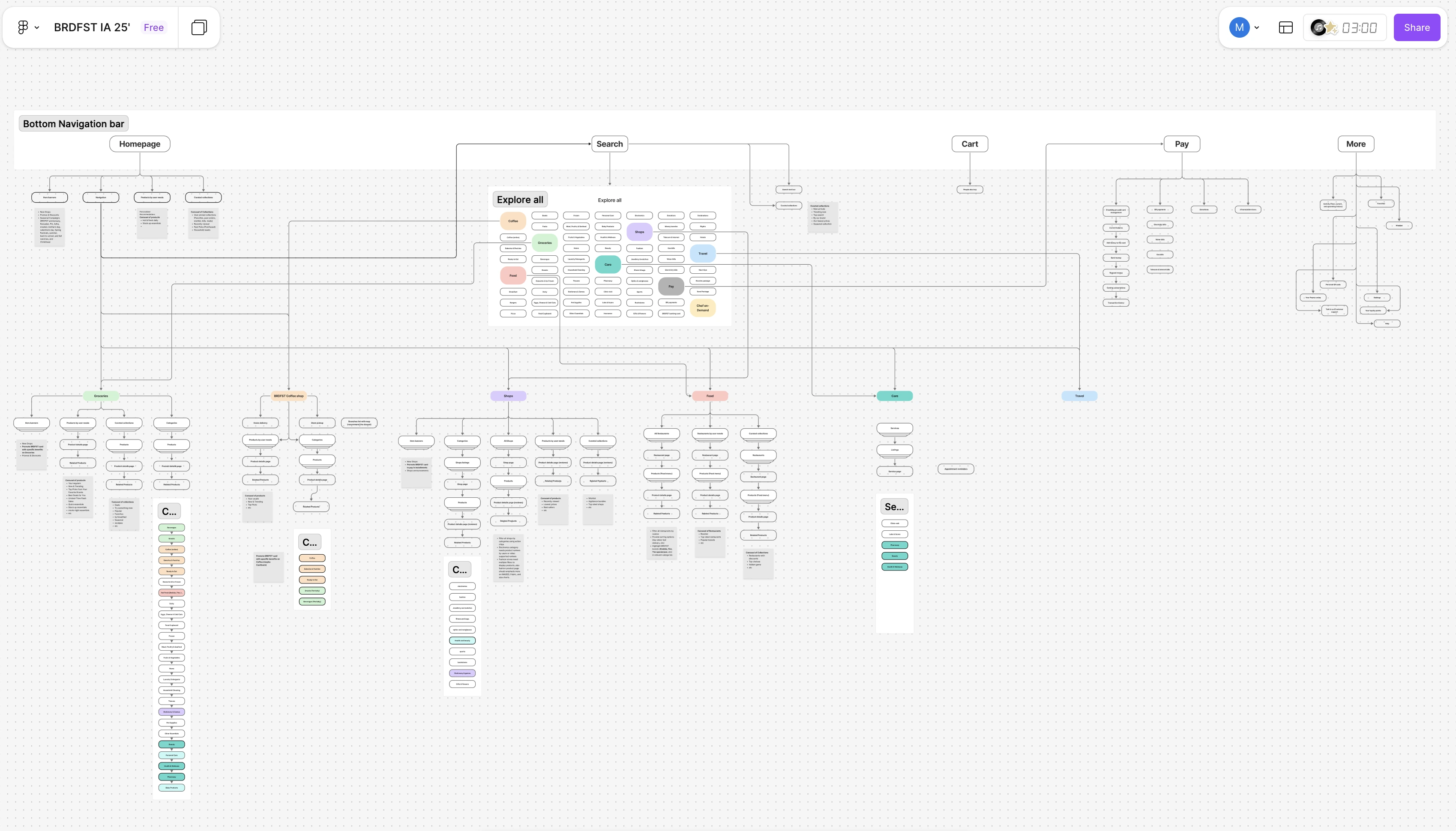
Homepage, Search, and Explore All needed to form one coherent model. Every business needed visibility, but competing requests had to be evaluated against shared customer needs.
- Supermarket
- Protect the established shopping mission.
- Food + Coffee
- Build visibility around frequent occasions.
- Pay
- Stay accessible without behaving like a vertical.
- Emerging businesses
- Earn discovery before mature adoption.
- Growth
- Create space for cross-vertical merchandising.
- Operations
- Adapt to availability by location.
04 / Exploration
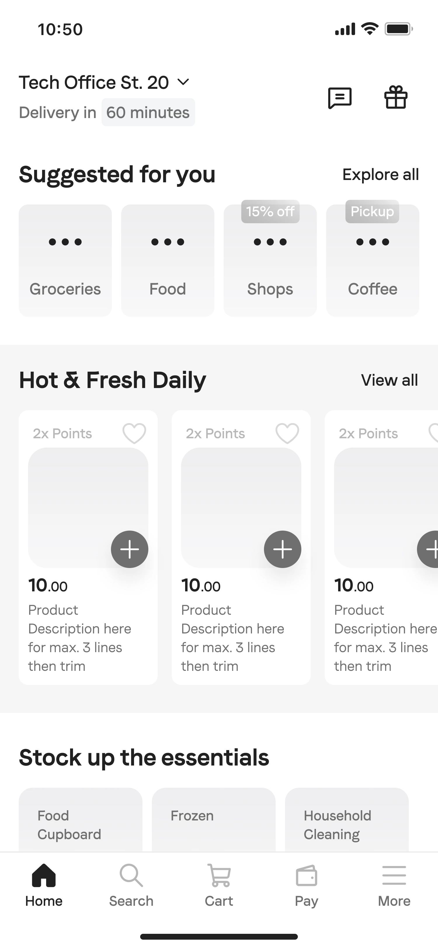
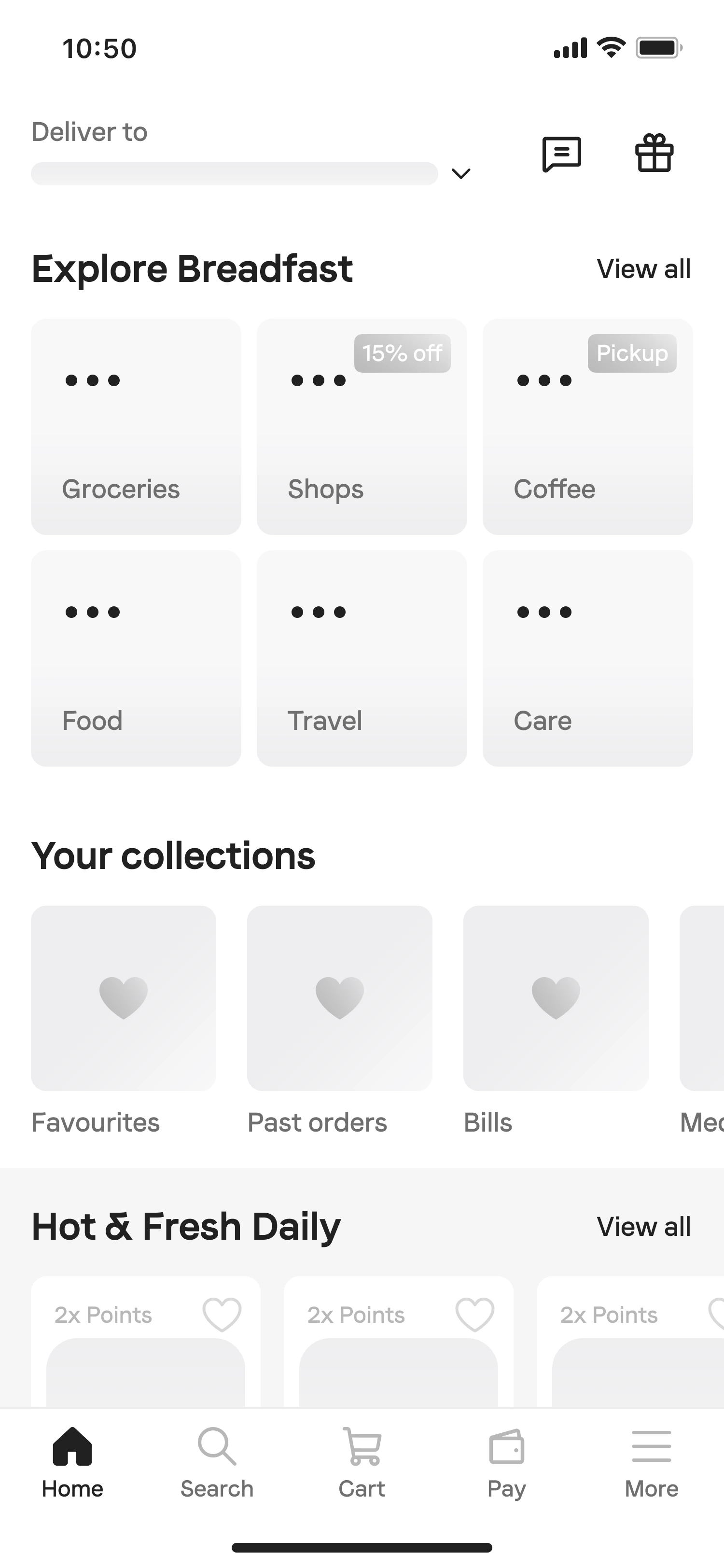
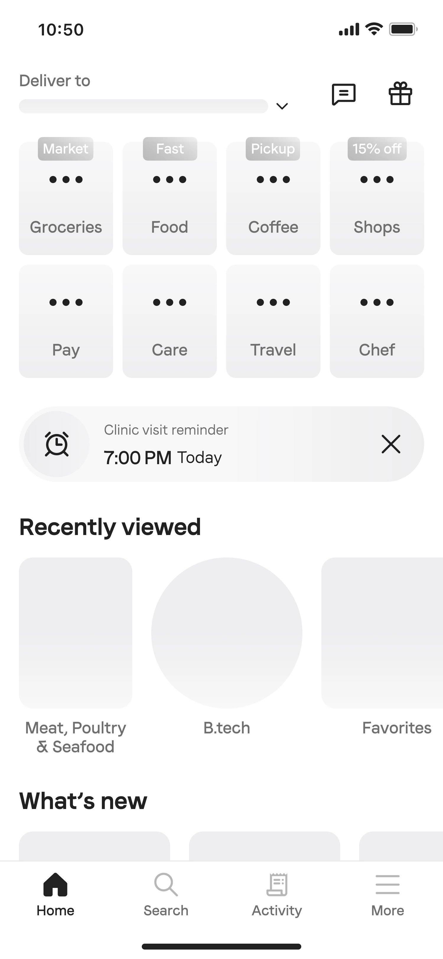
Each iteration answered a different architectural question.
The work moved from architecture and stakeholder needs into materially different directions: making services visible, balancing discovery, and turning sections into a feed.
05 / Navigation trade-offs
Three credible models. Different costs to discovery.
Stakeholder interviews established shared requirements: protect Supermarket as the dominant mission, reveal the broader range, adapt to location, and support future services without restructuring.
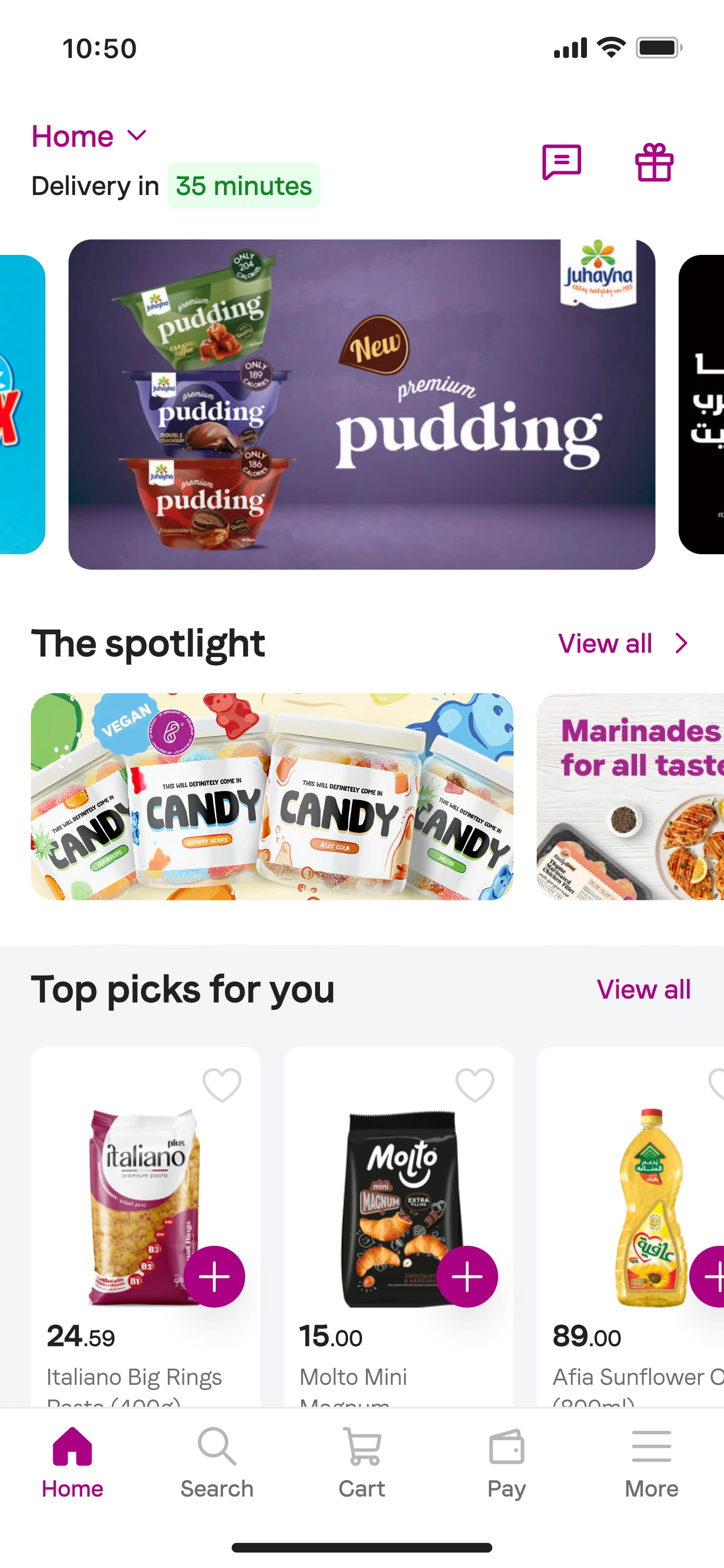
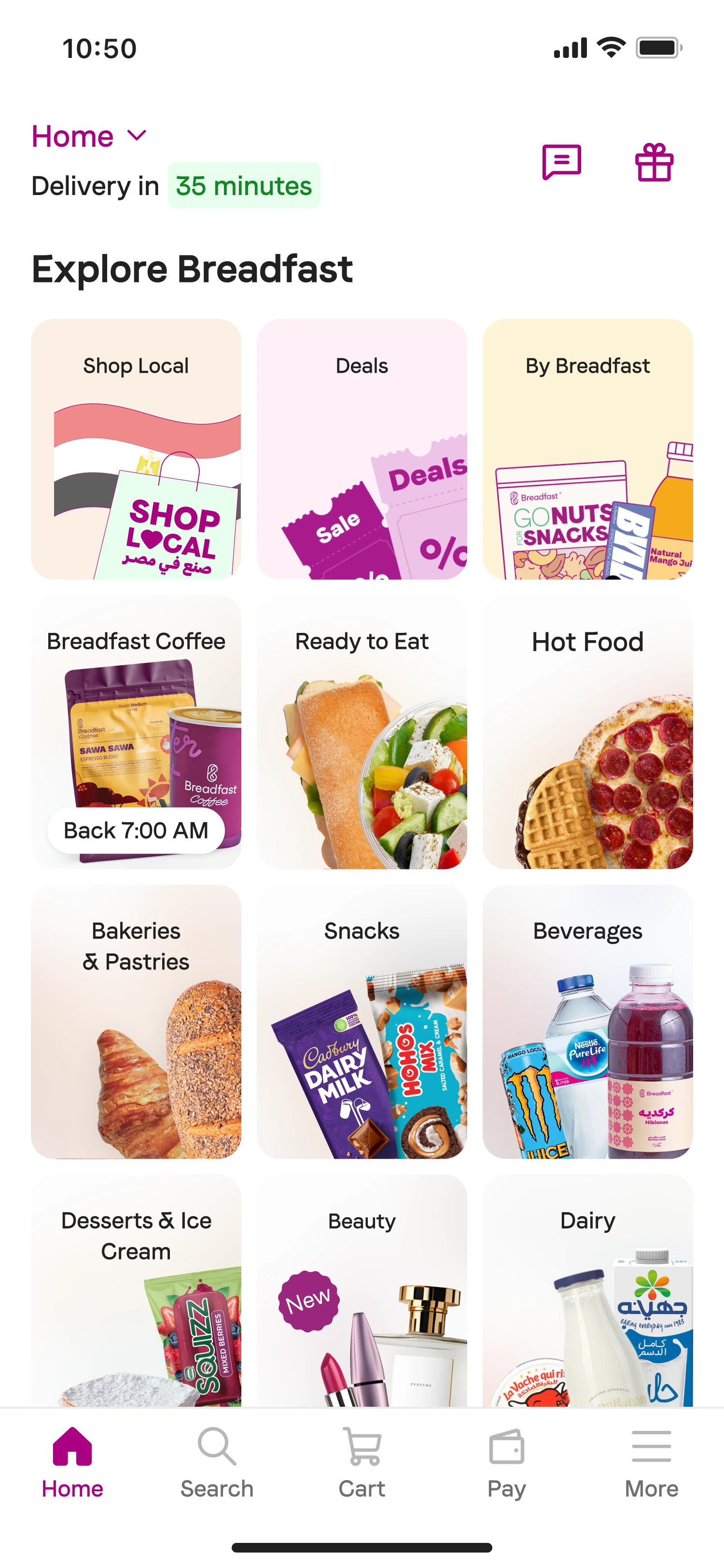
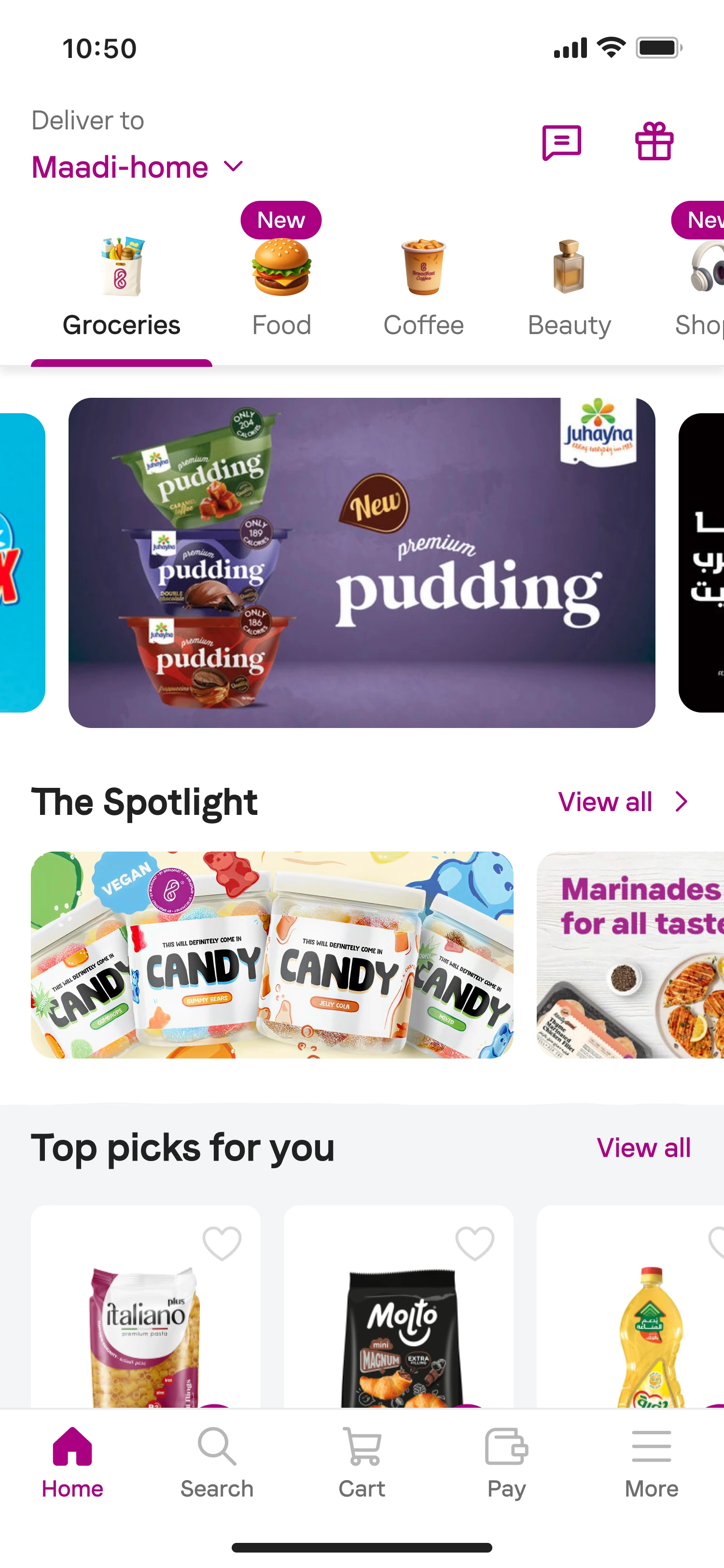
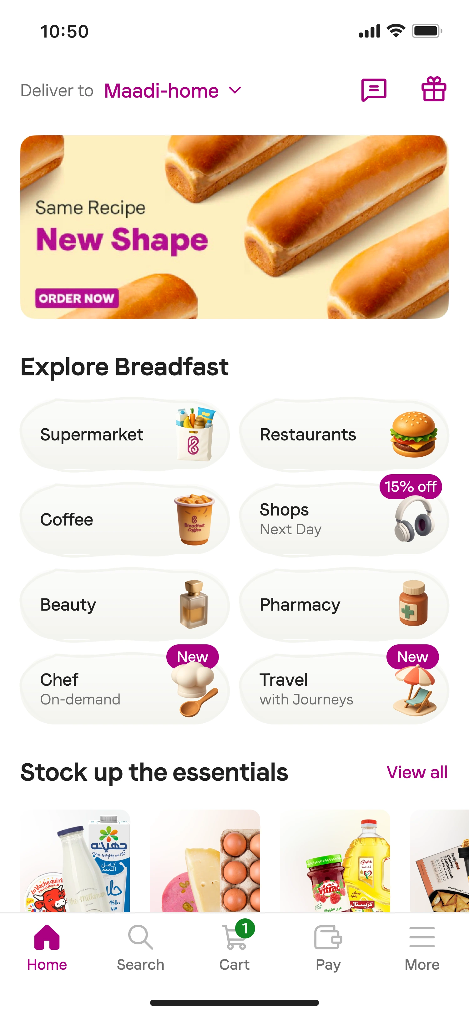
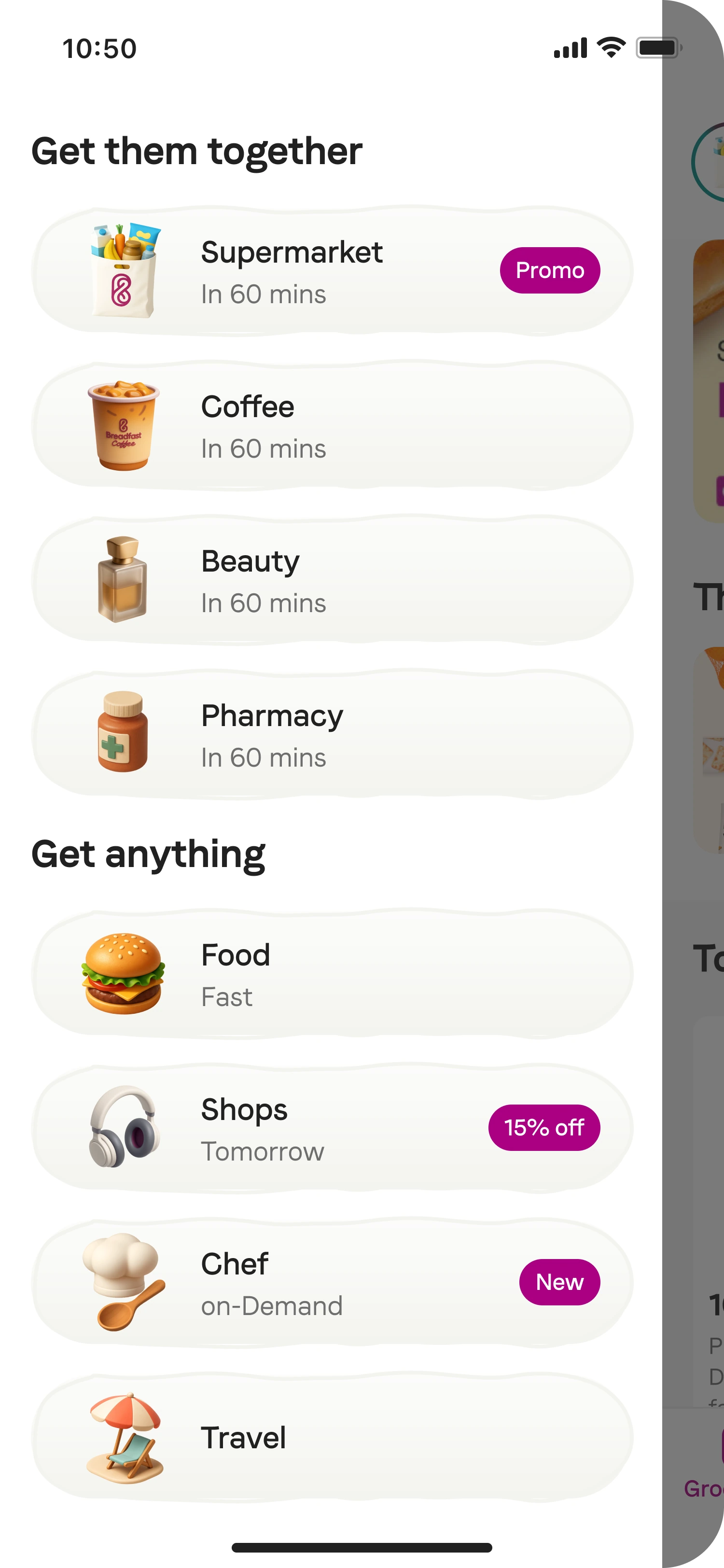
The side menu kept the homepage familiar, but new services remained behind an intentional action. Tabs preserved a Supermarket-first experience with fewer structural changes. A quick-access grid made the platform visible on arrival.
06 / Validation & decision
Two prototypes. Twelve user sessions. One navigation decision.
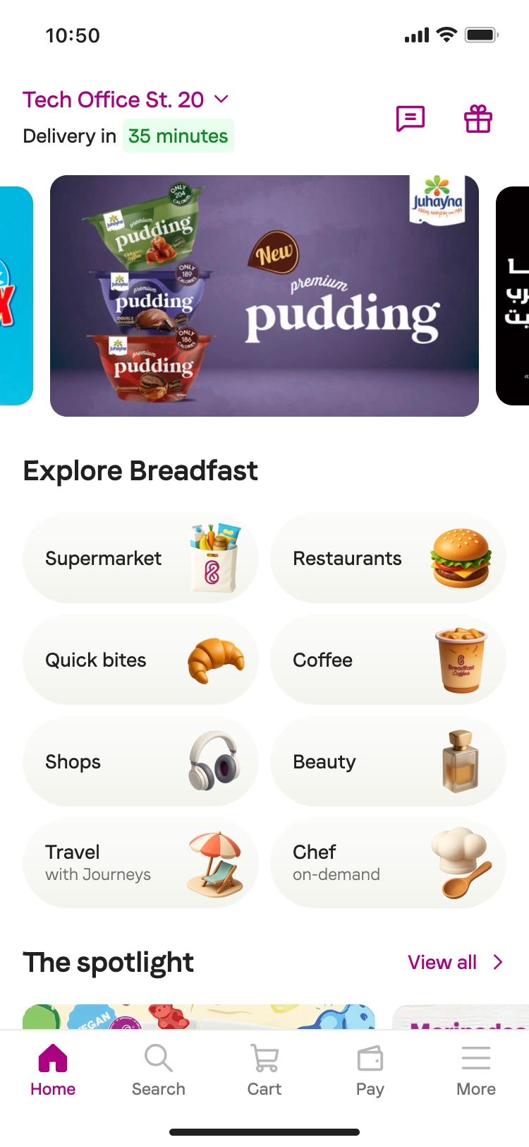
High-fidelity prototypes turned preference into evidence. Some existing customers only discovered Beauty and Food when the grid made those services explicit. Quick Access made Breadfast’s breadth visible before customers had to look for it.
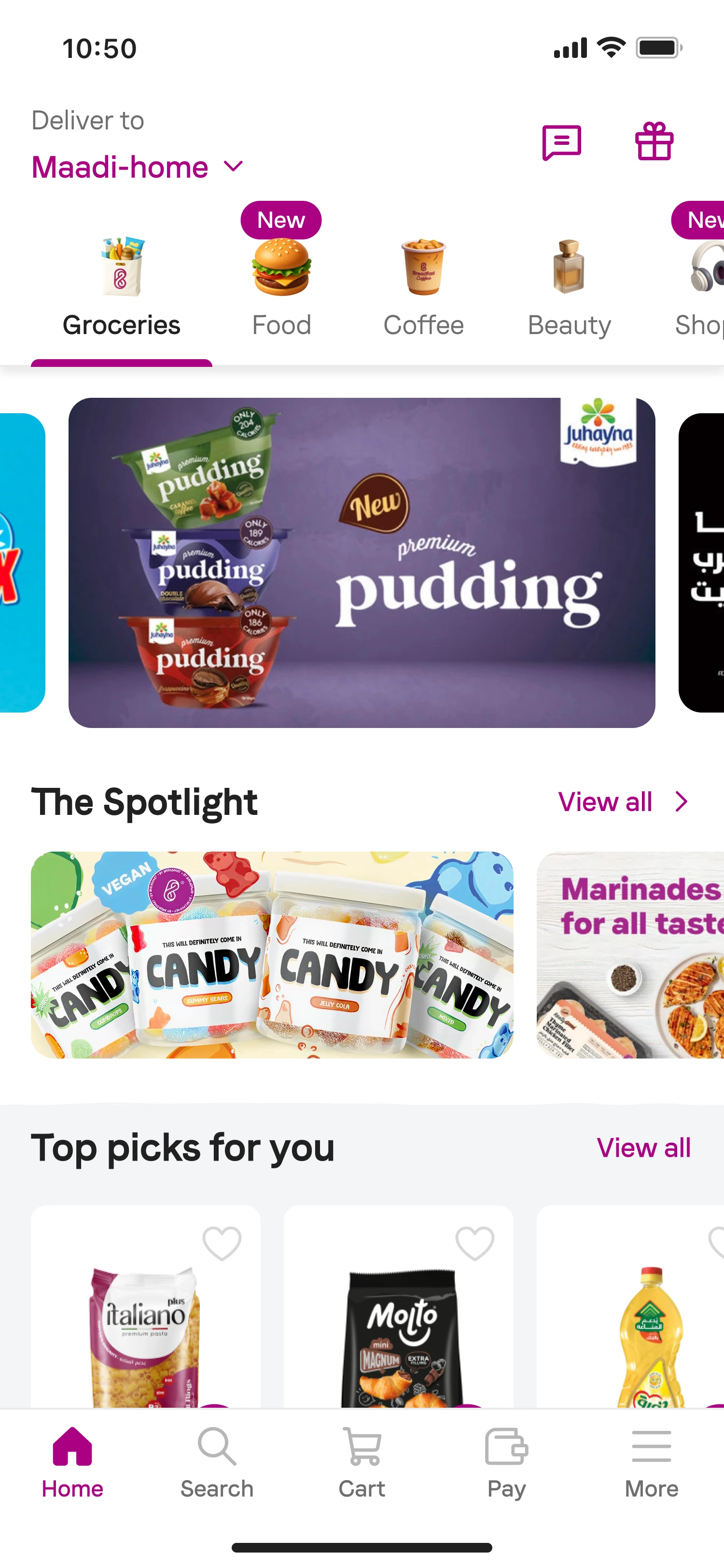
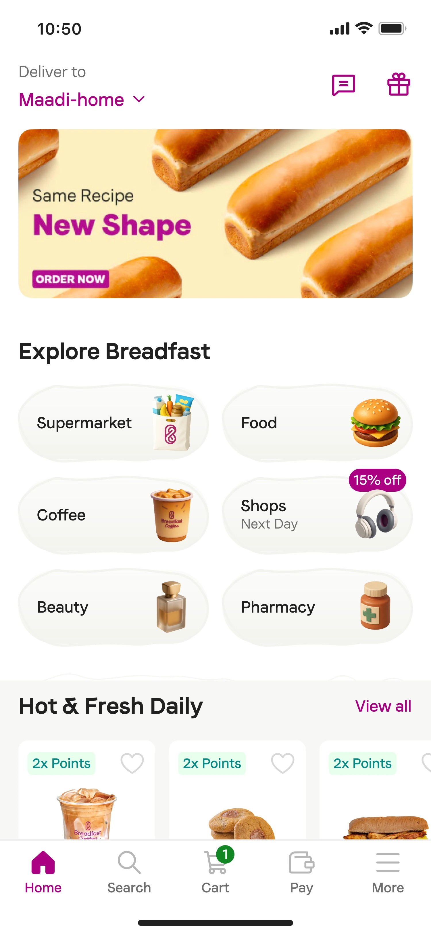
Tabs offered a transition. The grid offered a platform.
07 / Research changed the work
Visibility exposed unclear boundaries between services.
Navigation created awareness. Naming and destination behavior still needed to establish the right mental model. Visibility alone was not enough; the ecosystem also needed clearer language.
- Ready to Eat
- The label was understood less consistently.
- Food
- Food and grocery language overlapped; scope needed to be clearer.
- Supermarket
- Some customers expected multiple supermarkets inside.
- Shops
- The destination comparatively matched existing expectations.
08 / Operational reality
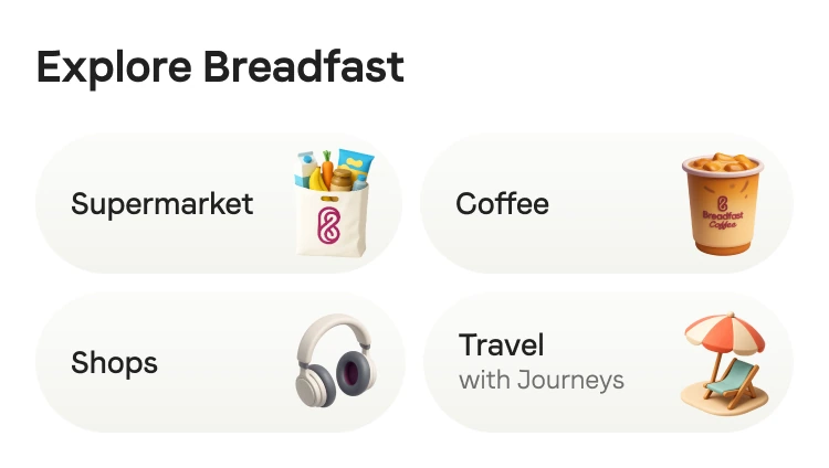
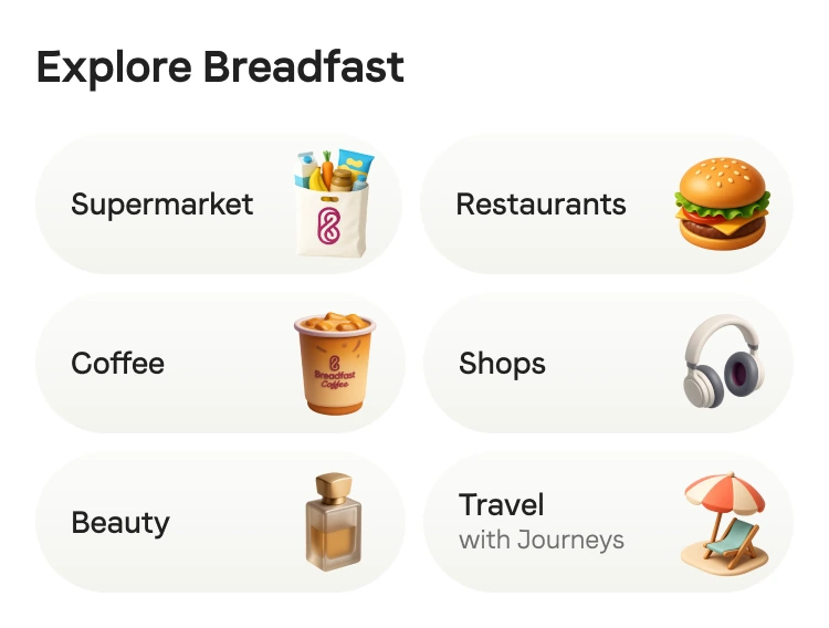
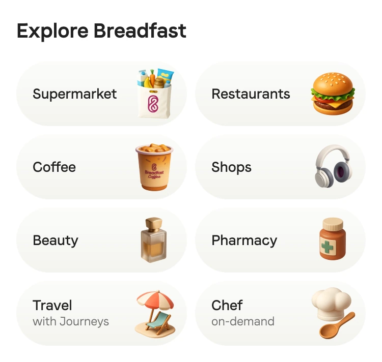
One component family. Different availability.
The homepage adapted to customers, locations, and service availability. The same navigation pattern supported different service counts and content priorities.

09 / Accessibility
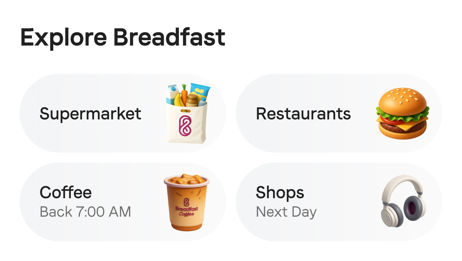
The layout changed. The ability to navigate stayed.
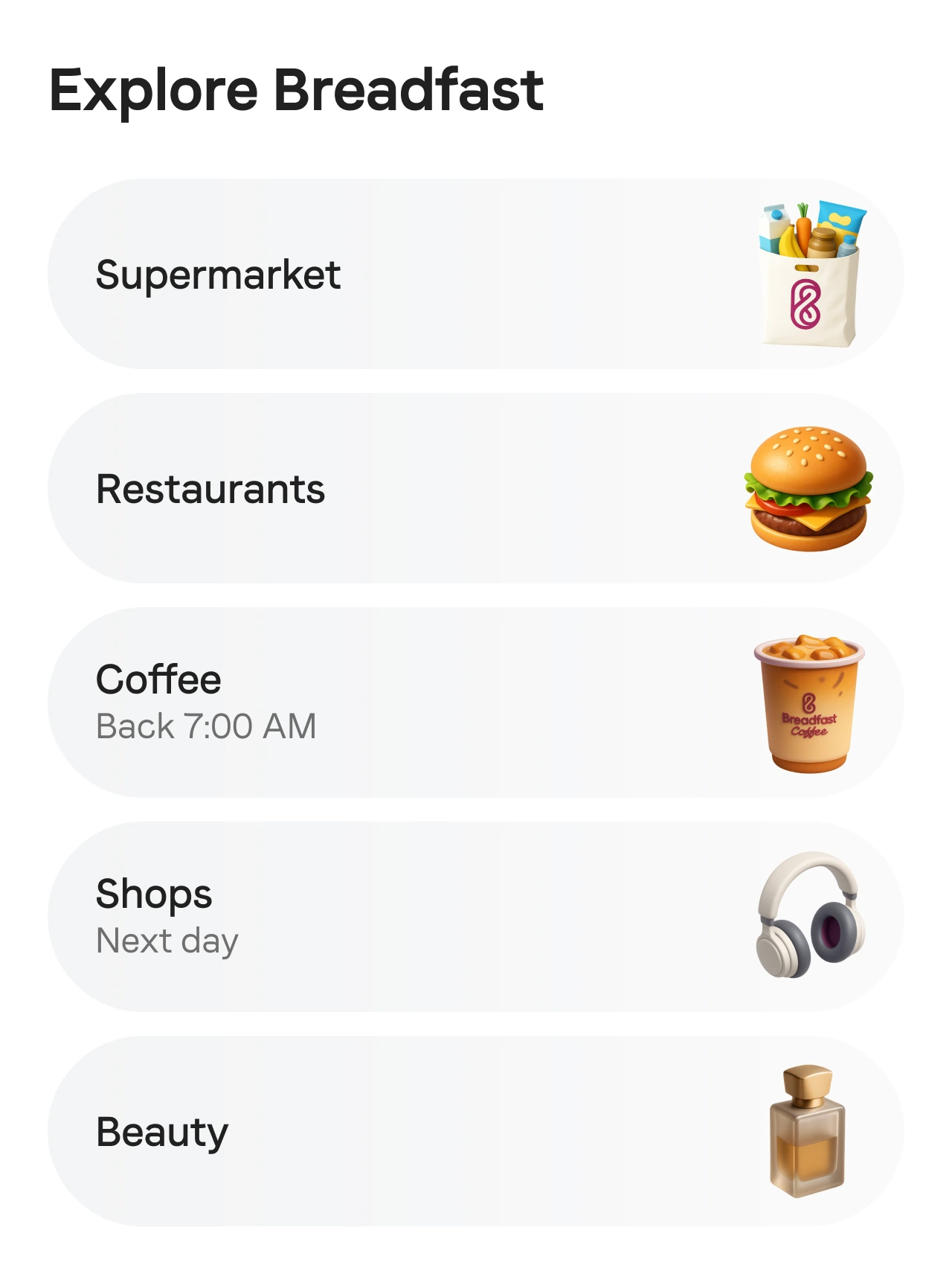
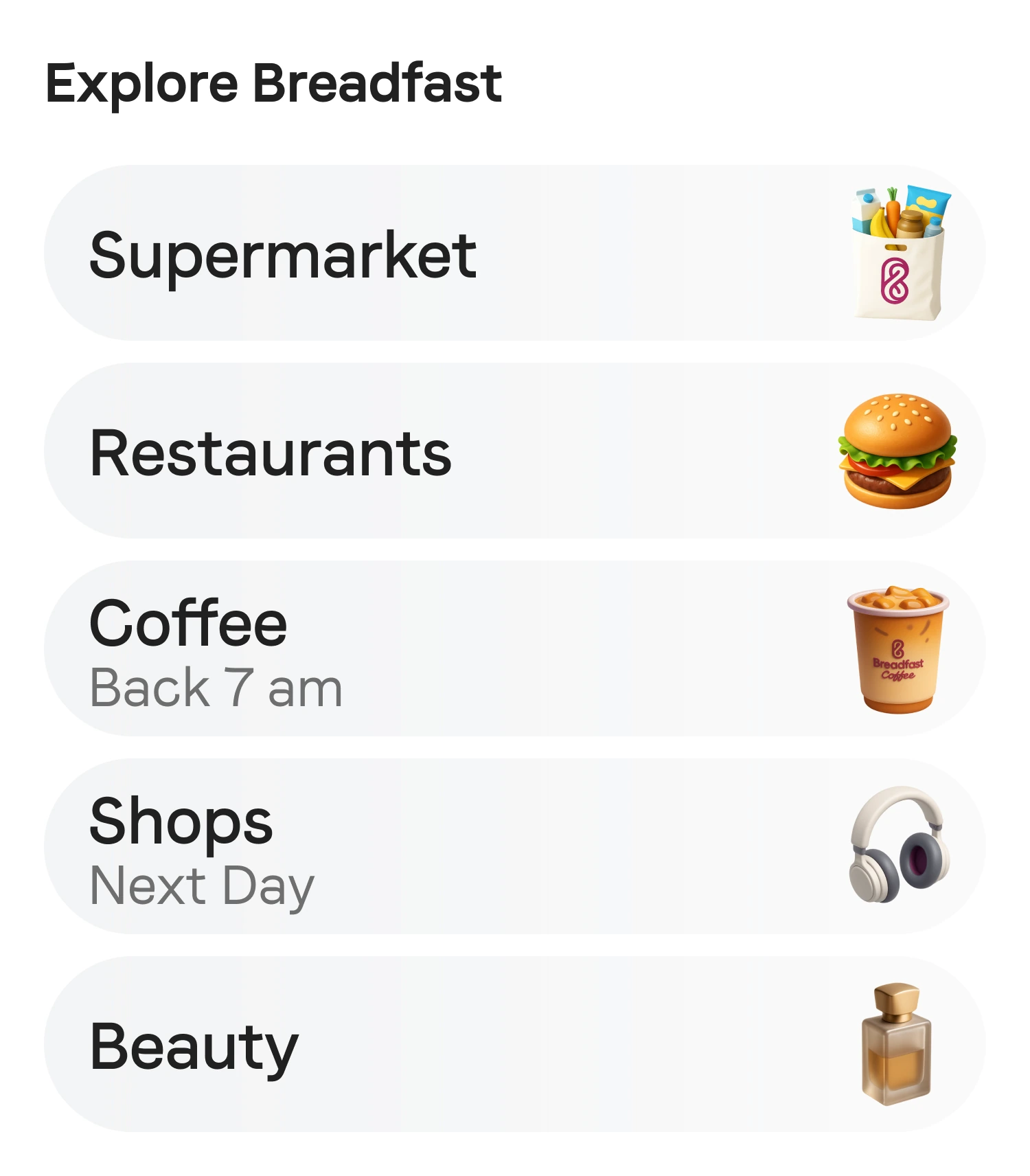
The chosen model had to survive the largest text, not just the happy path. When the grid could no longer preserve readable labels, it changed into a list.
10 / A coherent ecosystem
A repeatable visual language for an expanding platform.
A reusable AI prompt specification kept perspective, material, lighting, composition, color, and scale consistent across service illustrations. This gave new destinations a shared visual language.















11 / From solution to system
The homepage became a set of jobs.
Navigation, discovery, re-engagement, and merchandising could be composed around user context, availability, and business priorities. The grid addressed the immediate discovery problem; the complete future homepage did not need to launch at once.
- Navigate
- Quick Access to services.
- Discover
- Products and services relevant to the moment.
- Re-engage
- Recent activity and personal routines.
- Merchandise
- Native three-second video stories and new offerings.
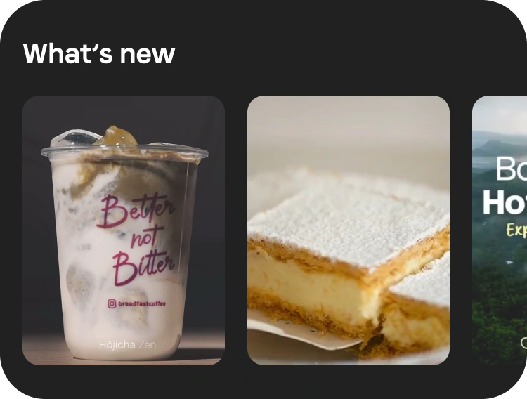
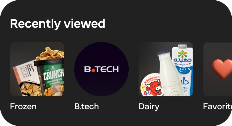
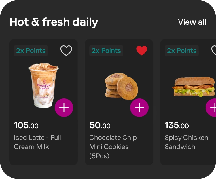
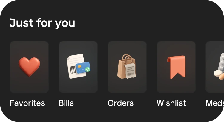
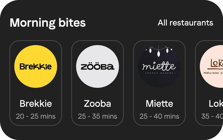
Modular composition is the broader system direction, separate from the grid experiment below.
12 / Beyond the happy path
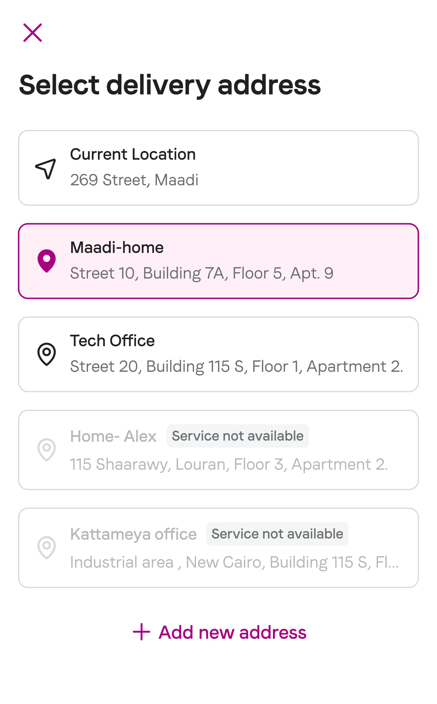
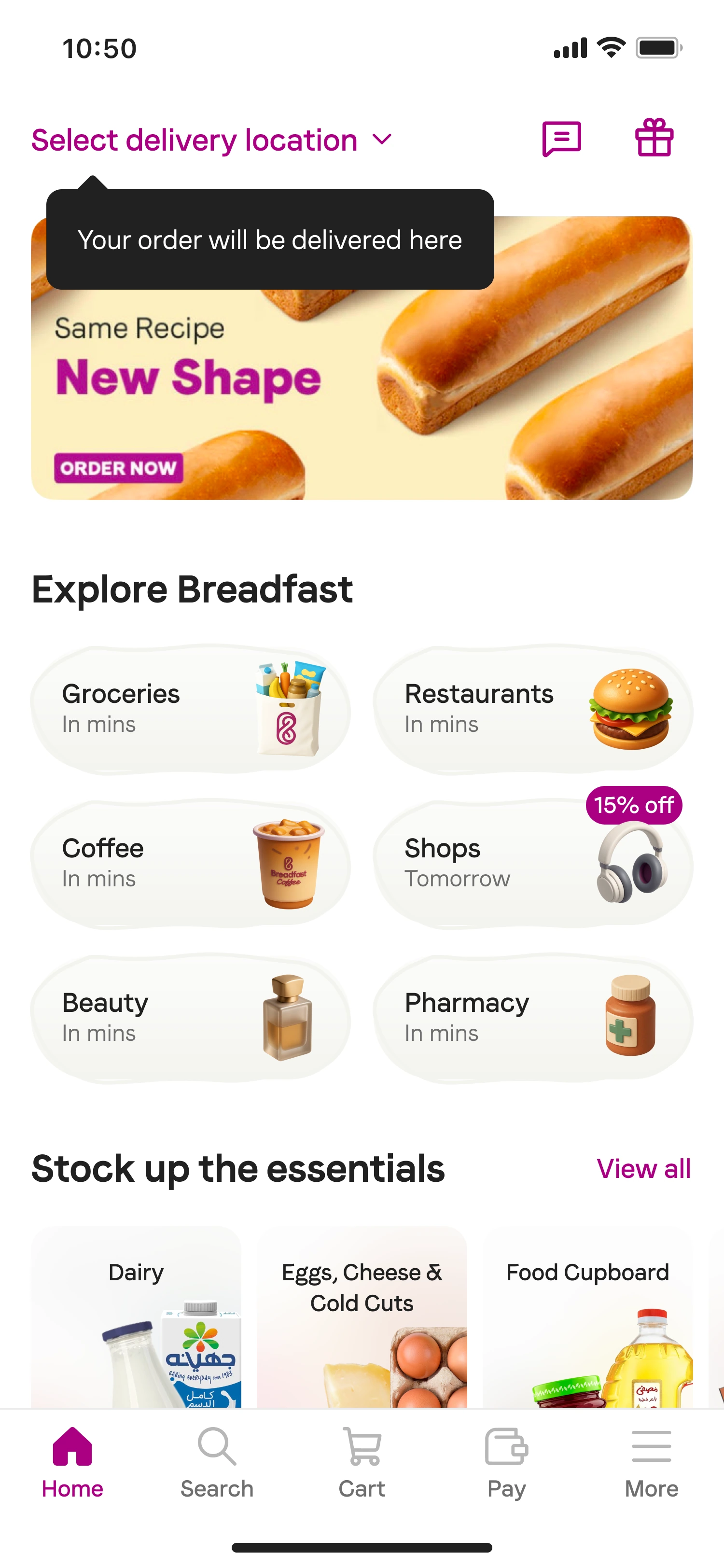
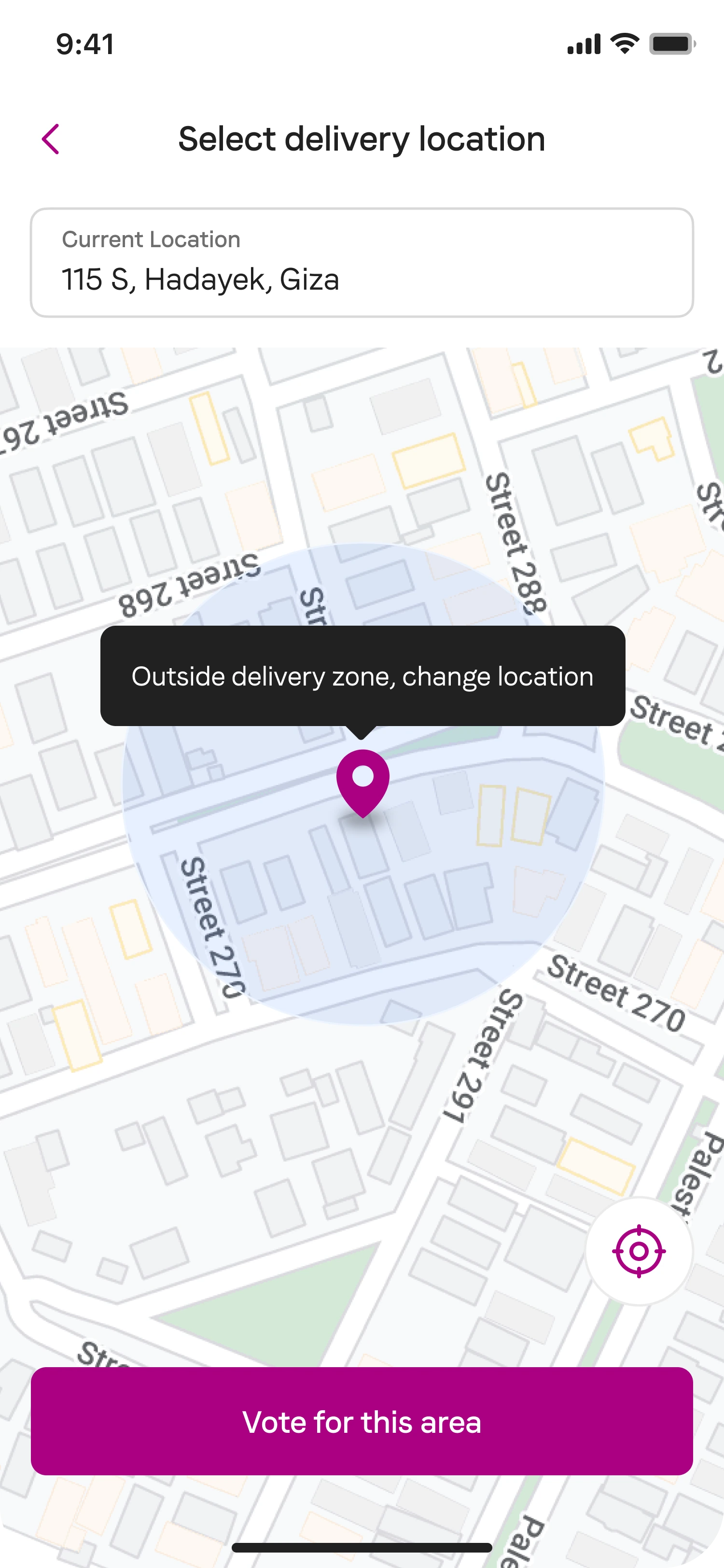
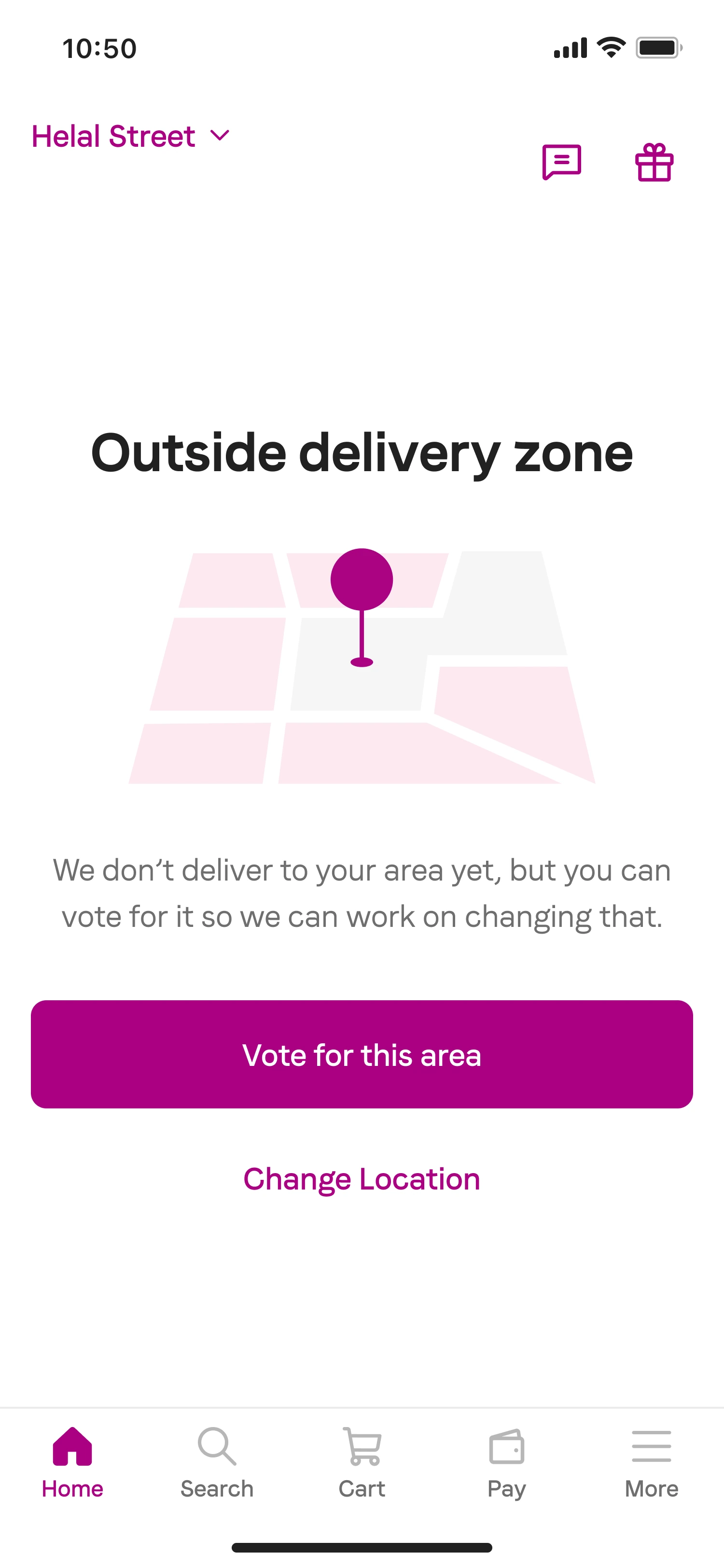
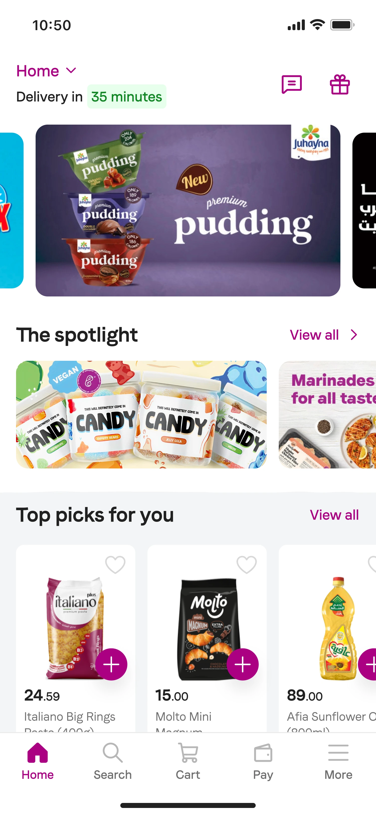
An unavailable service should not become a dead end.
The homepage needed to respond to delivery location and service availability, guiding customers toward what was available rather than ending the journey at an outside-delivery-zone message.
13 / Experiment & impact
Make discovery measurable while protecting the core business.
A three-week experiment split customers 50/50 between the existing homepage and the homepage with the new grid. Vertical open rates were the focus; Supermarket and core metrics were guardrails.
14 / Discovery impact
10% → 37% vertical open rate.
The new homepage grid was compared with vertical entry points inside the supermarket category grid. The destinations did not change. Their architecture and visibility did.
Making services explicit and structurally distinct increased the likelihood that customers opened them.
Reported in the original case study. The original analytics dashboard is not currently accessible.